UI and UX are often spoken about as one service, yet they solve different parts of the same problem. User experience design defines the journey: what people need, where they begin, what decisions they make, and how the product helps them succeed. User interface design gives that journey a visible form through hierarchy, typography, color, controls, spacing, and motion.
Why UI/UX Design Matters
When design is weak, users pay the price. They search for actions, misread labels, repeat steps, abandon forms, and contact support. The business pays too through lower conversion, slower adoption, extra development revisions, and features that solve the wrong problem. Good design reduces this friction before it becomes expensive code.
The goal is not to make every screen minimal. It is to make every decision understandable. A financial dashboard may need dense information, while a booking flow should reveal only what is needed at each step. The right interface follows the context instead of copying a fashionable layout.
Organizations that need research, product thinking, and interface execution together often work with specialist UI UX design services rather than treating design as decoration at the end of development.
Start With Evidence, Not Assumptions
A useful design process begins by understanding the audience and the business outcome. Stakeholder interviews clarify priorities and constraints, but they do not replace conversations with the people who will use the product. Even a small research round can reveal vocabulary, workarounds, anxieties, and environmental limits that a project brief misses.
Researchers may combine interviews, observation, surveys, support-ticket analysis, analytics, and competitor reviews. The method should match the question. Analytics can show where people leave a flow, while an interview can explain why. Watching someone complete a real task often exposes friction that users forget to mention.
The output should be more than attractive personas. A concise research summary needs to identify user goals, recurring barriers, important scenarios, and evidence behind each recommendation. Teams can then turn findings into a prioritized problem statement: who is struggling, what they are trying to achieve, and why the current experience fails them.

Build the Information Architecture and User Flow
Information architecture organizes content so people can predict where things live. For a website, this includes navigation, page hierarchy, labels, categories, and search behavior. For a product, it also includes how features and objects relate. Clear architecture prevents the interface from becoming a collection of disconnected screens.
User flows map the steps between an entry point and a meaningful outcome, such as creating an account, completing a purchase, submitting a claim, or inviting a teammate. Designers should include decisions, errors, empty states, permission requests, and recovery paths—not only the ideal route. A flow is successful when users can understand where they are, what happens next, and how to go back safely.
Content belongs in this stage too. Plain labels and specific calls to action reduce uncertainty. “Save billing address” is clearer than “Continue” when the action has a lasting effect. Error messages should explain what happened and what the user can do next without blame.

Move From Wireframes to an Interactive Prototype
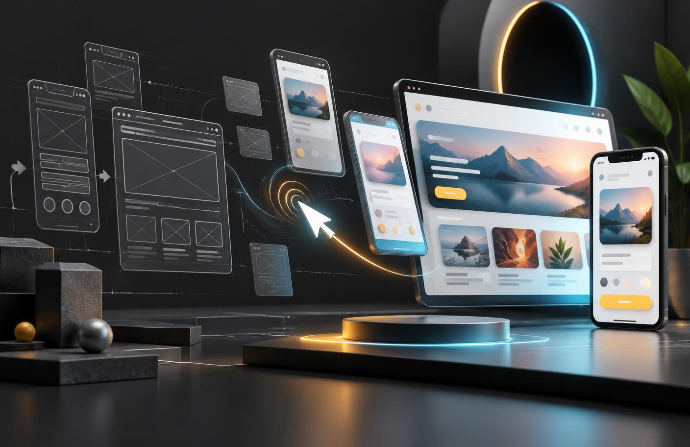
Wireframes translate a flow into layout without spending time on polished visual details. They help teams test hierarchy: what appears first, which action is primary, what information is grouped, and how a screen changes across devices. Keeping early work simple makes feedback about structure easier to hear.
A prototype connects those screens so stakeholders and users can experience the proposed journey. It does not need to reproduce every feature. It should be realistic enough to answer a specific question, such as whether a first-time visitor can compare plans or whether an account owner understands a permission request.
Prototypes also reduce implementation ambiguity. Developers can inspect behavior, responsive priorities, component states, and transitions before estimating the final build. This collaboration works best when designers discuss technical constraints early and developers challenge unclear states before handoff.
Create a Clear and Accessible Interface
Visual design guides attention. A deliberate type scale separates page titles, section headings, labels, and supporting text. Spacing creates relationships between elements. Color communicates brand and state, but should never be the only signal for an error or status. Icons can improve scanning when their meaning is familiar; otherwise they need labels.
Accessibility is part of quality, not a final checklist. Designers should consider readable contrast, keyboard focus, touch-target size, zoom, motion sensitivity, form labels, error identification, and content order from the start. Accessible patterns often improve the experience for everyone, including people using a phone in sunlight or navigating under time pressure.
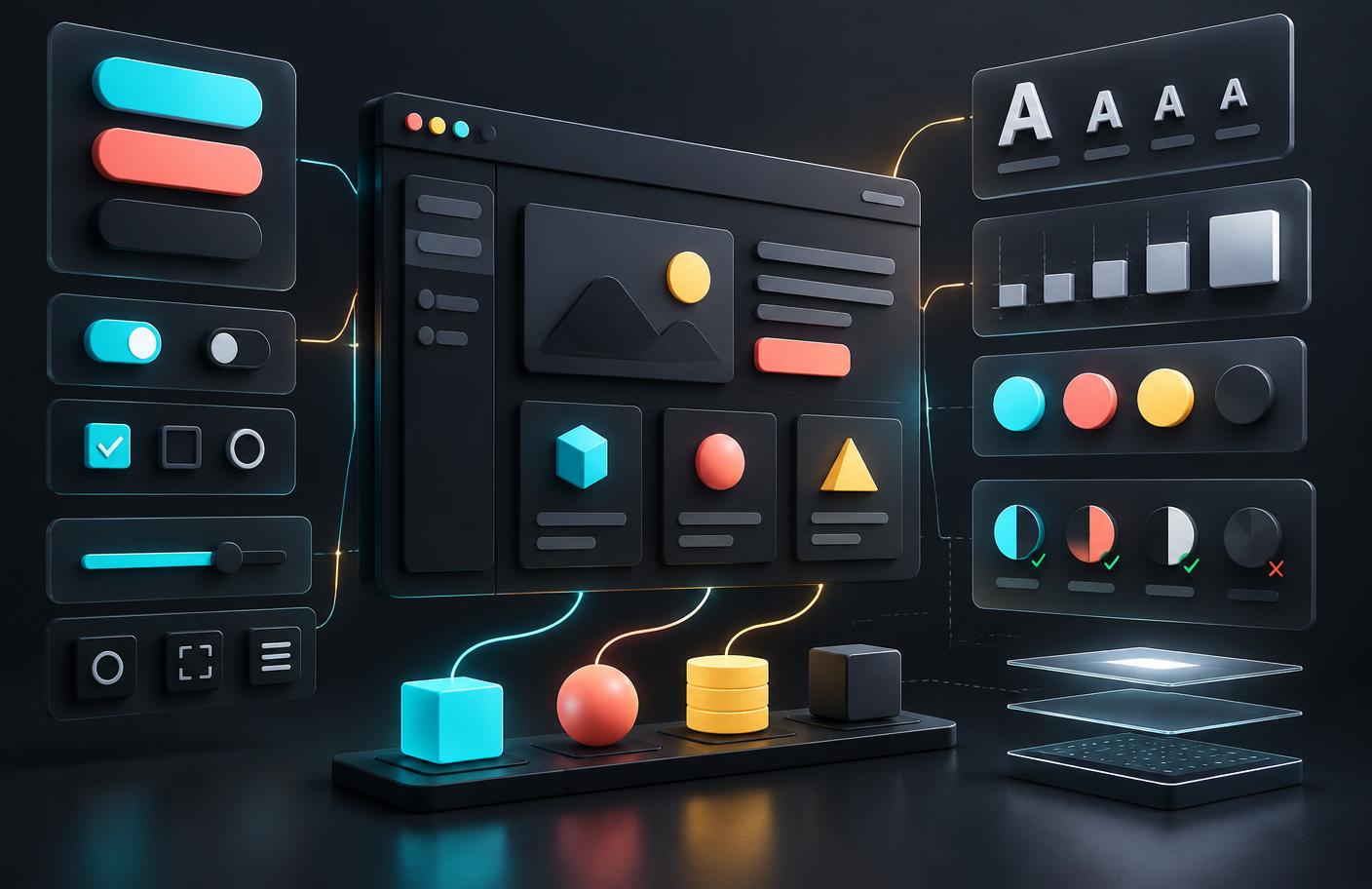
A design system keeps these decisions consistent. It combines reusable components with tokens for color, typography, spacing, borders, and motion, plus guidance about when each pattern should be used. A button is not only its default appearance; the system should account for hover, focus, disabled, loading, and error states. This shared language helps design and engineering move faster without rebuilding the same decisions.
Test With Users and Iterate
Usability testing replaces debate with observation. Give participants realistic goals, avoid telling them where to click, and watch for hesitation, wrong turns, repeated actions, and misunderstandings. Five thoughtful sessions can uncover recurring issues, although the right sample depends on the audience and risk.
Prioritize findings by impact and frequency. A confusing checkout total deserves attention before a minor preference about icon style. After revisions, test the critical path again. This cycle can be lightweight, but skipping it means the first real test happens after launch with paying customers.
Launch is not the finish line. Product analytics can track task completion, conversion, errors, feature adoption, and drop-off. Support messages and feedback reveal issues that numbers cannot explain. Measure a baseline before major changes so the team can tell whether the new design improved the outcome rather than merely changing the appearance.

How to Choose a UI/UX Design Partner
Look beyond a portfolio of polished screens. Ask how the team learns about users, turns evidence into priorities, tests its work, collaborates with developers, and measures results after launch. A strong partner should explain trade-offs clearly and show the reasoning behind a design, not defend every early idea.
Define ownership before the project begins. Clarify who recruits research participants, supplies analytics, approves content, handles accessibility review, and maintains the design system. Agree on milestones based on decisions and tested flows rather than a fixed number of screens, because screen counts encourage output instead of outcomes.
A Practical UI/UX Workflow
- Discover: align on goals, audiences, constraints, and success measures.
- Research: gather behavioral and qualitative evidence from real users.
- Define: prioritize problems, requirements, journeys, and content.
- Design: create flows, wireframes, prototypes, and visual systems.
- Validate: test critical tasks, fix patterns of friction, and retest.
- Deliver and learn: support implementation, review the built experience, and measure outcomes after launch.
Frequently Asked Questions
What is the difference between UI and UX design?
UX design shapes how a product works and how easily people can complete a goal. UI design shapes the visual and interactive layer people see and touch. Strong digital products need both disciplines to work together.
How long does a UI/UX design project take?
A focused website or product feature can take several weeks, while a complex platform may require months. Research access, decision speed, number of user flows, and testing rounds usually affect the schedule more than screen count alone.
What should a UI/UX design deliverable include?
Useful deliverables may include research findings, user journeys, information architecture, wireframes, interactive prototypes, tested interface designs, a component library, accessibility notes, and implementation guidance.
How do you measure whether UX design is successful?
Measure outcomes tied to the product goal: task completion, time on task, error rate, conversion, activation, retention, support requests, and qualitative feedback. A visually attractive interface is not enough if people still struggle.
Design for Clarity, Then Keep Learning
The best UI/UX work makes a complex product feel understandable without hiding important choices. That result comes from a repeatable process: learn from users, organize the journey, prototype the interaction, build an accessible system, test real tasks, and measure what happens after release. Visual polish matters, but it becomes valuable only when it supports confidence and completion.
Start with one important journey and one measurable outcome. Improving that path with evidence creates a stronger foundation than redesigning every screen at once.

About the Author
Muhammad Dawood Khan
Muhammad Dawood Khan is an SEO Expert and technology content writer focused on AI, software development, emerging technologies, and practical digital business insights. He writes research-driven content designed to make complex technology topics easier to understand.
View LinkedIn Profile